featuring contemporary art directly from the artist
and limited editions of Old Masters.
begins here at Kunstplaza !
by young and emerging artists
in our online gallery.
Kunstplaza - your touch point for contemporary art and stylish living
Discover an inspiring range that is not only aesthetically pleasing but also reflects the pulse of modern interior design.
With us, you'll find carefully curated artworks that will lend your home a unique character and enrich your living environment. Be inspired by the diverse creative possibilities and transform your home into a place of inspiration and elegance.
Welcome to our platform for contemporary art, tasteful design and stylish home trends!
Kunstplaza sees itself as a modern network platform and online portal for contemporary visual art and modern design.
Are you an artist, art dealer, gallery owner, curator, art or culture journalist, interior designer, or simply someone interested in art who loves beautiful things? Then Kunstplaza certainly has something to offer you!
Kunstplaza magazine offers valuable insights into current cultural events and various art forms, from painting and sculpture to performance art, design, architecture, performing arts, music, and film. You'll also find a wealth of inspiration for interior design, home trends, and living Kunstplaza
As an art dealer and interested buyer of art objects, you can use Kunstplaza Buy art online – often directly from the artist or fresh from the studio.
Acquire unique works by contemporary artists and rising stars in the art world who share their visions of beauty and thus open our minds. You will also find limited editions and high-quality reproductions
You can purchase the art objects directly from the respective artist or vendor.
The Kunstplaza Our online shop for design, decor & living is an invitation to create a stylish home and integrate the beauty of design into every aspect of your life. Be inspired by exquisite design objects and decorative items that combine functionality with aesthetic appeal.
Online gallery. Art marketplace.
Find and buy unique works of art in our online art gallery.
Kunstplaza is not only a virtual place where contemporary artworks are presented, but also a creative home for artists and art lovers alike.
We offer you an inspiring and carefully curated online gallery where unique pieces by contemporary artists from all over the world, limited editions and high-quality art prints as well as unique design objects are waiting to be discovered.
Imagine how your rooms are brought to life by carefully selected works of art – each piece tells its own story and gives your home a distinctive touch.
As an art lover, you will find unique works by international artists, emerging talents of the art scene and established masters at Kunstplaza .
Advantages for art lovers at a glance:
- Curated selection of unique pieces, limited editions and high-quality art prints
- International artists from numerous countries
- Artwork directly from the artist
- Free shipping and free returns for up to one year (for a specific selection, see detailed description of the works)
- Insured shipping with tracking
- Helpful tips & tricks
- Sources of inspiration & recommendations
In addition to established artists from Germany and Europe, Kunstplaza also enables young, up-and-coming artists to present their artworks to an interested audience. About our gallery.
We take a less elitist approach than many traditional galleries and want to offer talented artists without long exhibition histories the opportunity to share their wonderful work with the world.
Advantages for artists at a glance:
- Presentation of own artwork
- selling artworks
- Increasing brand awareness
- Featured as part of an artist portrait in our magazine
- Support with art marketing
- Distribution on social media (Instagram, Pinterest, …)
- To attract the attention of buyers, collectors, patrons, agents or sponsors
- Promoting your own website, Instagram channel, etc.
- Helpful tips & tricks
Discover artworks from nationally and internationally recognized artists as well as from young, little-known newcomers.
Using thematic and regional search filters, you can find interesting artists and galleries directly in your immediate vicinity. Making contact is then quick and easy.
Whether abstract paintings, figurative paintings, drawings, or street and urban art, in our online gallery you will find an international selection of styles, techniques, and art movements.
Advantages for gallery owners and art dealers at a glance:
- Find promising works of art & discover up-and-coming newcomers
- Recognizing trends in the art scene early on
- Establish contact with artists, potential buyers, and other gallery owners and dealers
- Presentation of one's own artwork portfolio (in an art magazine)
- Developing new target group(s) for the sale of artworks
- Increasing media reach
- Networking in the art market
- More sales, revenue and profit
- Presentation and promotion of one's own gallery, website, brick-and-mortar store, social media channel, …
Benefits for brands, sponsors and patrons at a glance:
- Recognize trends and developments in the art scene early on
- Find promising works of art and discover talented newcomers
- Find works, achievements, concepts and projects worthy of funding
- Discover suitable artists for advertising and brand collaborations
- Increased media reach, prestige, and reputation (through portraits or feature articles in our art magazine)
- Contact with artists and creative professionals of all kinds
- Networking in the art market and the art scene
- Promoting your own website, projects, events, etc
- and much more.
Kunstplaza is a source of inspiration for interior designers who want to enrich their projects with contemporary art and high-quality art prints.
Here you will find works and inspiration to create spaces that are not only aesthetically pleasing, but also tell stories and evoke emotions.
With Kunstplaza we offer you the artworks and resources to bring your visions to life. Our carefully curated selection of artists and printing techniques guarantees the highest quality and diversity.
Advantages for interior designers at a glance:
- A carefully curated selection of unique pieces, limited editions, and high-quality art prints
- International artists from numerous countries
- A variety of styles, techniques, eras and color palettes for different interior design styles
- Artwork directly from the artist
- Free shipping and free returns for up to one year (for a specific selection, see detailed description of the works)
- Insured shipping with tracking
- Helpful tips & tricks from industry experts (in our magazine)
- Sources of inspiration & recommendations (in our magazine)
We offer access to carefully selected works of art that have the potential to generate above-average returns.
While other asset classes stagnate or fluctuate, the world of art exudes stability and appreciation. With every purchase at Kunstplaza you are not only investing in fascinating works of art and the passion of artists, but also in sustainable wealth accumulation.
Advantages for investors at a glance:
- A carefully curated selection of unique pieces, limited editions, and high-quality art prints
- International artists from numerous countries
- Diversity of styles, techniques, eras and media
- Artwork directly from the artist
- Helpful tips and tricks for investing in art (in our magazine)
- Buying recommendations (in our magazine)
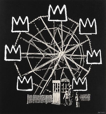
Street Art “Banksquiat (Grey)” (2019), signed by Banksy, limited edition silkscreen print

Abstract oil painting “Lost Time” (2024) by Jonesy

Edyta Grzyb “Insane” (2016) – Limited edition fine art pigment print
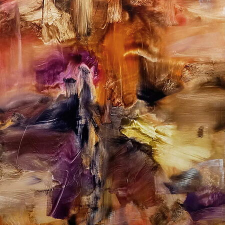
Abstract oil painting “DRMR 21-43” by Marc Podawczyk

Sabrina Seck: “Hydra” (2023), giclée fine art print on canvas

Hyperrealistic oil painting “Light of Hope” by Daria Dudochnykova

“See the world in colors” (2024) – Abstract oil painting by Beata Belanszky Demko
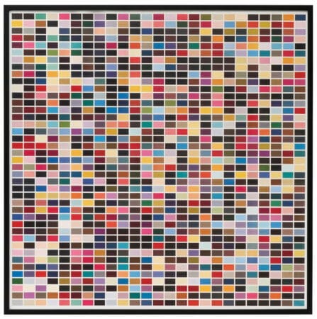
“1025 Colors” (1974) by Gerhard Richter, reproduction on paper
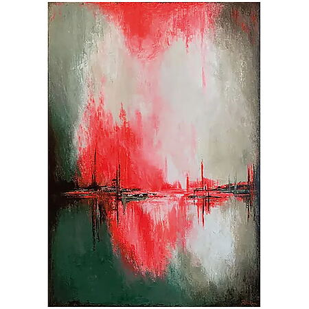
Abstract mural “Keep On Exploring” (2024) by Constance Renken

Oil and acrylic painting “Straight Out” (2023) by Valentina Andrees

“ETERNITY CRYSTAL” (2022), acrylic and Swarovski® crystals on canvas, by Edyta Grzyb
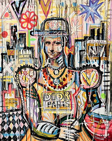
Urban Art acrylic painting “Love Dior” (2025) by Mercedes Lagunas

“Fiery Heart” (2025) – Expressive mixed media painting by Lana Frey (Czech Republic)

Landscape painting “Bohlenweg” (2018) by Susanne Wind

Oil painting “Series Gift of Hope | Unanimity IV” (2024) by Lezzueck Coosemans
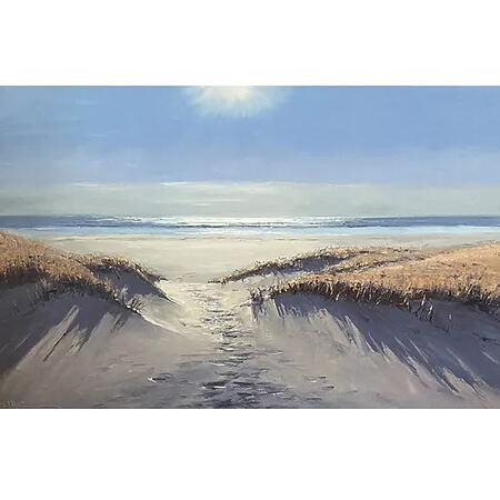
Oil painting “Beach access in backlight” (2024) by Stefan Dobritz

Pin Up Pop Art “Virnaburger” (1965), limited edition offset lithograph by Mel Ramos
Cin Cin – Metal wall decoration
Original price was: €59.9559,95 €The current price is €59.95. 47,96 €
Art Magazine
In our digital art magazine, authors with art expertise publish informative articles and exciting contributions on topics related to art, design, and culture.
This includes, above all, artist portraits; introductions to galleries, art dealers, and museums; introductions to various art fields and styles; excursions into art history; current news from the art trade, art market, art auctions, exhibitions, and art fairs; news from the art scene; sources of inspiration, and much more.
In doing so, the Kunstplaza magazine places particular emphasis on a critical engagement with works and themes. The articles are thoroughly researched and offer the reader an in-depth insight into the background of the artworks and their societal significance.
Our art magazine also inspires you with exciting insights into the world of interior design, home decor, and offers you valuable perspectives on current trends.
The world of art is colorful – true to this credo, we want to highlight the diversity of creative work in our online magazine – even beyond the traditional art world.
