From musical notes to symbols: Band logos and their meaning
Music is a universal language that connects people all over the world. It has the unique ability to evoke emotions such as sadness, joy, enthusiasm, and longing without a single word being spoken. Therefore, it is used in creative therapiesto counteract mental illness.

Photo stock.adobe.com © claudiozacc
During our teenage years, many of us decorated our rooms with various items from famous musicians. Each item, be it a poster, a T-shirt with our favorite band's logo, or a signed album cover, spoke volumes About uspersonality and our musical tastes. Some of them were extremely quirky, like the so-called "Kiss Kasket," the Rolling Stones telephone, or the Slayer Christmas sweater.
However, they all have one thing in common: the band's logo. It's not just a simple graphic or a wordmark, but their visual trademark. But have we ever wondered what's actually behind this logo? What's the meaning behind this artistic symbol, which often represents more than just a band's name?
Show table of contents
The Rolling Stones
The tongue logo is undoubtedly one of the most iconic logos of all time. It's a trademark that many recognize, but don't always immediately associate with the legendary rock band.

Photo by Les Hull / The Rolling Stones Concert
Although many believe that Andy Warhol , the famous pop artist, designed the logo, it was actually designed in the early 1970s by then-art student John Pasche . The Rolling Stones commissioned him after Mick Jagger was impressed by a tour poster he had designed.
The inspiration behind the design is not based on Mick Jagger's lips, as is often assumed. Instead, Pasche found his creative inspiration in an image the singer showed him: a picture of the Hindu goddess Kali, depicted with her mouth open and tongue sticking out.
The tongue logo first appeared on the album "Sticky Fingers"Pasche initially received fifty pounds for his work. Later, he received another two hundred pounds, and finally, in 1984, he sold the copyright to the band for 26,000 pounds.
The Rolling Stones logo has been modified several times over the years, but its core identity has remained. Today it is still printed on various products such as clothing, mugs, and other accessories.
Nirvana
Sometimes it doesn't take much to describe an entire world. This is especially true for Nirvana's logo. The simple yellow face, with closed eyes and a slight smile, became a symbol of the grunge scene.

Photo by GESPHOTOSS @gesphotoss, via Unsplash
Kurt Cobain , the frontman of Nirvana, designed the logo himself. However, the inspiration came from a surprising place: a strip club called "The Lusty Lady" in Seattle, which had a similar smiley face on its roof. Nevertheless, the logo and its origin have been the subject of legal disputes in recent years .
Kiss
Probably the most controversial logo of the 1970s belongs to the band Kiss. After the members agreed on the name, Ace Frehley, the former lead guitarist, created the logo with a marker. Because he drew it by eye, the lines in the two "S"s are not exactly parallel.
What the band had overlooked, however, was the unfortunate similarity between the double-S in their logo and the SS runes. They were actually meant to represent lightning bolts. This fact only became clear in the early 1980s when KISS was alerted to it by the German government. This meant they could no longer use their logo in countries that had banned Nazi symbols (Germany, Austria, Israel, etc.).
Thus, the band was forced to adapt its logo in these countries. Fortunately, this was quite easy to do by replacing the lightning bolts with the letter Z. This story serves as a reminder that even the simplest symbols can have political and historical implications

Photo stock.adobe.com © Alfredo
Aerosmith
Unlike Nirvana's logo, which has remained unchanged, Aerosmith's logo has been adapted numerous times over the years. The first version was Raymond Toabano, one of the original members. This design featured the band's name, with each letter framed by wings.

Photo by Selbymay, CC BY-SA 4.0, via Wikimedia Commons
All subsequent versions differed significantly from the original logo. However, the wings and, of course, the name remained as the main elements. The last change to the logo occurred in 1982 and was first used on the cover of "Rock in a Hard Place" .
AC/DC
There are some secret facts about the band that many people don't know, including the meaning and origin of their name. Brothers Malcolm and Angus Young came up with the band name together after seeing the initials "AC/DC" on their older sister Margaret's sewing machine. These initials stand for "Alternating Current" and "Direct Current ." All the members loved the suggestion and felt it embodied their energy.
The first version of the logo, used between 1974 and 1976, resembled a classic warning sign, hand-drawn using stencils. This design served as a starting point and was further developed over time. Although the band used the name AC/DC and a lightning bolt in their logo from the beginning, the first version bore no resemblance to the now-famous symbol.

Photo stock.adobe.com © erika8213
Queen
We learned many interesting facts about this legendary band through the 2018 film "Bohemian Rhapsody," especially about their flamboyant singer, Freddie Mercury. Although the band consisted of four members, he was the creative force behind Queen (formerly known as Smile).
Therefore, it should come as no great surprise that he is responsible for their new name and their majestic logo . It looks almost like a coat of arms, featuring a large Q, a crown, a fire-breathing phoenix, and other elements. Freddie gave the band a certain British aristocratic. This feeling is also conveyed by their logo, which bears some resemblance to the British Coat of Arms, the emblem of the British monarchy.
In addition to the main elements, the zodiac signs of the Queen members displayed. To the left and right of the Q are two lions, representing John Deacon and Roger Taylor. In the center is a shellfish, symbolizing the constellation Cancer and thus representing Brian May . And, of course, the two fairies at the bottom represent Freddie Mercury, who was a Virgo. Apart from the colors, little has changed over time.
Fun fact: On the logo of “A Night At The Opera” in 1975, one lion is blonder than the other – just like Roger Taylor.
Ramones
Almost everyone knows them, whether because of their music or their logo, which is still printed on clothing and worn today. The band, which shaped the punk rock scene , consisted of four members:
- Joey Ramone
- Dee Dee Ramone
- Johnny Ramone
- Tommy Ramone
Arturo Vega, the band's friend and art director, is often considered the fifth member . He is responsible for the logo, which, although it looks quite simple at first glance, is composed of several elements. It is clear that his inspiration came from the American coat of arms .

Photo by Mabg1989, CC BY-SA 4.0, via Wikimedia Commons
The logo consists of a bald eagle surrounded by stars. Next to the olive branch, it holds a baseball bat, and in its beak is a banner with the well-known words "Hey Ho Let's Go" .
Fun fact: For many years, their main source of income was T-shirts with the Ramones logo. In total, they sold more shirts than albums.
Conclusion
It's always interesting to see how all these world-famous bands got their start. It makes you realize that the best resources or the biggest budgets aren't always what's needed to create something unique . Often, it's the passion , the creativity , and the unique perspectives that make the difference.

Owner and Managing Director of Kunstplaza . Publicist, editor, and passionate blogger in the fields of art, design, and creativity since 2011. Graduated with a degree in web design from university (2008). Further developed creative techniques through courses in freehand drawing, expressive painting, and theatre/acting. Profound knowledge of the art market gained through years of journalistic research and numerous collaborations with key players and institutions in the arts and culture sector.
You might also be interested in:


Featured Art


Design and Decor Highlights
-
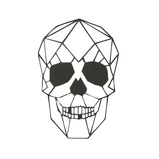
 J-Line wall decoration "GeoSkull" - Geometric metal art, black
59,90 €
J-Line wall decoration "GeoSkull" - Geometric metal art, black
59,90 €
VAT included.
Delivery time: 2-4 working days
-
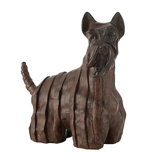
J-Line Decorative Dog Sculpture "Scottish Terrier" made of dark brown resin (large)
119,00 €
VAT included.
Delivery time: 1-3 working days
-
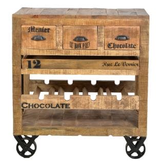
Wine cabinet made from recycled mango wood, antique black metal fittings
1.065,00 €
VAT included.
Delivery time: 6-11 working days
-
Sculptural table lamp "Contour" made of papier-mâché (white)
145,00 €
VAT included.
Delivery time: 2-4 working days
-
J-Line TV cabinet with 1 drawer, wood / metal
The original price was: €899.00449,00 €The current price is: €449.00.
VAT included.
Delivery time: 5-8 working days
-
"Cutie" terracotta vase with raffia details (grey) - M
38,00 €
VAT included.
Delivery time: 3-5 working days
-
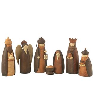
J-Line 7-piece nativity scene figure set, resin (brown)
125,00 €
VAT included.
Delivery time: 3-5 working days